Posts Tagged ‘watercolour’

Small Wonder!

December 13, 2012

Image

Low Tide, Bob Wakefield, 11×14. oil on canvas

Image

Prada, Bob Wakefield, Oil on Canvas, 14×18 inches

Normally, I wouldn’t post a painting complete with frame, but these two paintings just beg for frame recognition. The paintings by themselves would just not be the same.

Bob Wakefield is one of about  20 artists in the Fort Gallery artists collective in Fort Langley, B.C. The show Small Wonder! is the pre-Christmas, salons-style exhibit that allows the artists to bring out their non-series paintings, their small works, trials, sketches, etc. They are beautiful and they are affordable.

Wakefield was originally a student of Susan Falk, who is also with the gallery, and they work in thick impasto and expressionist style.  Falk’s is showing some farm-related imagery – a painting of a red barn, a large drawing of a sunflower, and a painting of her beautiful little iris-rimmed pond that is just big enough for a small row boat and a gaggle of geese. Pond Study is loose and dramatic with autumn colours contrasting with an ultramarine blue.

051 (Small)

Pond Study, Susan Falk. 24×12, oil on canvas

033 (Small)  034 (Small)

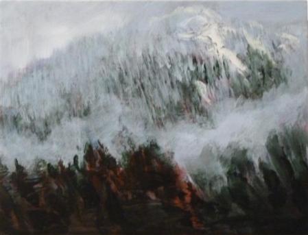
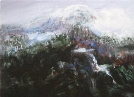
Two paintings from the series “From the bus: Coquihalla“, Veronica Plewman, each 6×8 inches, acrylic on board.

Plewman is showing 6 paintings from the series, “From the Bus: Coquihalla”.  The paintings describe the area near Merritt and Kamloops in British Columbia where the highway cuts through the mountain pass on Highway 5.  Plewman has captured the wonderful quality of colour that sings through a snowy landscape where, to the unschooled eye, one might be excused to think that there was just white and dark. She paints the blues, rusts, ceruleans and yellow greens that sparkle through when a bit of winter sunshine illuminates the hills. In these small paintings, she manages to describe the mightiness of the mountains and the detail of soft fog captured between the hills or a stand of bare alder with their raw umber branches. These are simply jewels of craftsmanship and vision.

039 (Small)

Search, Bloom, Shine, and Drift,  four prints by Edith Krause, , approximately 9×12 or 10×10 inches.

Several of Edith Krause’s small prints from “The Butterfly Effect” series are available in the show. I wrote about them recently so if you would like to see samples of those, go looking back a post or two.  Search, Bloom Shine and Drift are new works to the gallery and have quite a different feel to them. Krause creates prints with great attention not only to the inherent ecological message but also to the texture and surface qualities of her work. She pays great attention to finishing detail. These works are simply  perfect in craftsmanship.

050 (Small)

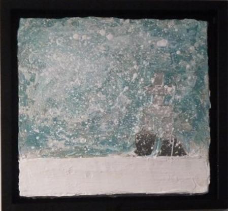
“Inukshuk” Pat Barker, Acrylic and Mirror on board. Approximately 8×8 inches.

With Inukshuk, Pat Barker gives us a preview of her upcoming show. She experiments with materials and includes bits of mirror in her design, enhancing the feeling of ice and snow.

040 (Small)

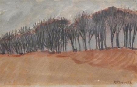
Carolina Poplars, France, Kristin Krimmel, gouache,  6×8 inches approx,

There are a number of works by artist Kristin Krimmel. This early gouache of hers describes the lines of trees along the roadside in France in the Department of the Marne.  Another landscape she offers is a watercolour of a farmhouse near Montpellier. It’s inspiration in style is an adaptation of the pointillists method or working. By overlapping small strokes of pure colour she blends and nuances the image to represent the special heat and light qualities of the Languedoc region on the Mediterranean.

042 (Small)

The Mas, Kristin Krimmel, watercolour on Arches paper

The surrealist of the group, Olga Khodyreva has contributed this fluid image:

062 (Small)

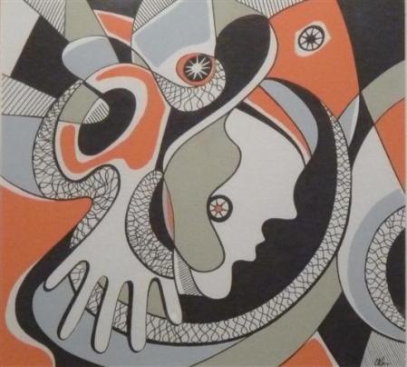
Drama, Olga Khodyreva, Gouache and ink on Paper. 12×12 inches.

It’s reminiscent of Joan Miro, Alexander Calder and Picasso with it’s tumbling figures.

059 (Small)

Winter wandering, Jennifer Chew, 8×10,  Velum and charcoal on wood panel.

Winter wandering describes fine branches emerging from snow. There is a delicate quality of calligraphy in this finely composed drawing.

FH Dempster Highway #1 (Small)

Salmon Glacier, Fiona Howath, 11 x 14, Silver Gelatin photograph

FH Fallen Giant (Small)

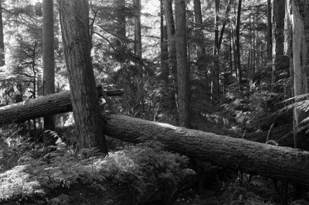
Fallen Giant, Fiona Howath,  Silver gelatin photograph, 11 x 14

Fiona Howath is an upcoming photographer whose work, in this exhibition, focuses on the natural landscape. She has crisp focus and  captures exceptional lighting. Detail is as important in the foreground as it is in the back. I particularly like the feathery quality of the ferns in Fallen Giant and in Salmon Glacier, I find the light/dark composition is excellent with the cloud, white above the mountain, casting dark on its slopes and brilliant sunshine delineating the character of the geological formation.

There are lots of paintings from each of the artists. As one is sold, it goes away with the purchaser and another gets put up.
I encourage you to go see the show and maybe even treat yourself to a painting. They are reasonably priced and there is lots of variety. Also there are several smaller items – greeting cards by four or five of the artists, fused glass tree ornaments (Judy Jones),  chap books and other small gift items.

Also featured in this show: Richard Bond, Lucy Adams, Doris Auxier, Fiona Howarth, Dorthe Eisenhardt, Judy Jones.

The location is 9048 Glover Road, Fort Langley, B.C. The gallery is open noon to 5 p.m., Wednesday through Sunday, and the show closes Sunday December 23rd.

Don’t forget to check out the web-site too:

www.fortgallery.ca 

Framing

November 21, 2011

I sometimes rescue paintings from secondhand shops or thrifts – originals that people have junked, not knowing what they have. Many are anonymous. I can’t figure out the signature (which is a good reason in favour of clearly printing one’s name when signing an original work of art).  It’s amazing what you can find. It’s also amazing what you cannot find – like any information on the author of the work. If anyone can help me out on that front, please do so.

Sometimes they come with framing and sometimes not.

I found a subtle watercolour portrait marked Don Quixote, very sensitively done, about six months ago is a beat-up black frame with a hand cut mat around it. The image is done in loose watercolour washes with blues for the shadows and warm tones of peach, rose madder and yellows in the warm tones. The eyes are beautifully drawn and the mouth and nose sensitively described.

Signature not clear: Kjariscal or K. Jariscal? Don Quixote, 2000. watercolor

“Never fear!” I thought, “I’ll just re-mat and re-frame it.

Yesterday I had the opportunity to take it out of it’s frame. Oy vey!

It’s backing was a dusty, dirty pulp board – the cheapest kind of cardboard with no refinement whatsoever and prone to picking up moisture. It was full of acid. The mat wasn’t acid free either. Where it had touched the painting, the watercolour paper was going brown. Yuck.

It was taped in with brown paper tape – kraft tape, it’s sometimes called. The backing was nailed in with rusty nails. I don’t suppose they were rusty when they were first tapped in there.

This is just a reminder – a cautionary tale. It just costs a small amount more to buy acid free matting and backing; or to use barrier paper (an acid free paper that separates the work of art from a cardboard backing).

An acid free framing will last a lifetime or more without losing its crisp whiteness; the non-acid free will be brown in two years and spoil the appearance of your gem, not only dulling the framing, but eventually attacking the work of art itself.

My new acquisition is now looking crisp and proud in its new frame.

My favorite custom framing place is Final Touch Frames in Vancouver on the corner of  4th and Quebec in a blue warehouse space. They are reasonably priced; and if you have works on paper that need mats in the smaller sizes, there are a lot of pre-cut mats that might suit your work.

One hundred and eighty degrees

December 11, 2010

A really good picture looks as if it’s happened at once. It’s an immediate image. For my own work, when a picture looks labored and overworked, and you can read in it—well, she did this and then she did that, and then she did that—there is something in it that has not got to do with beautiful art to me. And I usually throw these out, though I think very often it takes ten of those over-labored efforts to produce one really beautiful wrist motion that is synchronized with your head and heart, and you have it, and therefore it looks as if it were born in a minute.” (In Barbara Rose, Frankenthaler (New York: Harry N. Abrams, Inc. 1975, p. 85)

Wandering through museum after museum in Europe this summer, the thought I came up with for my own work was:

Be braver. Sweep away restrictions. Lean over the edge. Hang on by the rim if necessary. Try what you have always wanted to try. Work big.

I was swept away by the inventiveness of the art – much of it totally non-representational.  I also saw tons of Medieval art, especially the Gothic work done around 1200 a.d. So there was a wonderful mix of things to look at – not only in the museums and galleries, but in the streets as well.

I’ve come back all fired up to paint new imagery, to try a series of non-representational work that will perhaps lead into something else. While I’m doing it, I’m trying to remain open and experimental, for me.

I add that, “for me”, because I know that this kind of work has been done before.  You might say the work is derivative, and it well may be. The thing is, if I don’t explore this avenue, I’ll never know know what is at the end of it, will I? I’ll never know what I might have discovered.  Being safe  ends up also being static, repetitive, derivative.

There’s that word again. Derivative.

I believe that we are all influenced by our favorite painters; that we aspire to emulate some of these favored ones. To copy them would not be right, but to play with their concepts, to build on their ideas – these are fair challenges to take up. One’s own personality will come through in one’s own work.

Yes, there are great forgers who can copy another artist’s work flawlessly, to fool the public into believing it is from the master’s hand; but for the vast majority, we bring our own abilities, our own personality, our own skill-sets to the canvas and the results will carry our own personality, our own aspirations, our own interpretations. It’s valid to go there; it’s not valid to copy (without acknowledging or accrediting the original artists).

And so, brave as I want to be, adventurous as I have vowed to be, I have embarked on a series of large watercolours using a palette of graphite grey, yellow ochre and burnt sienna. I just haven’t been able to leave the representational sector. I’ve needed a crutch, a handle to hold onto, an old woman’s cane to steady me as I go. Yes, I am painting from things I have seen – but hopefully, you will not recognize them, when you see them.

The first six are done. They represent concrete floor repaired with a resin that fills the cracks and spreads either side of them. It is a warehouse floor with dints and scratches, with these large lines of resin making random patches in a different colour; and spots of paint from some former activity. Now this glorious floor is being recorded in watercolour – the floor of the Geneva Museum of Contemporary Art. 

Since I’ve been back in Vancouver, I’ve been noticing the repairs in the asphalt on the road – a thick black linear brushwork flanking either side of a breach in the paving. I’ve been noticing the lack of repairs where tree roots emerge on sidewalks, lifting the concrete, breaking it, and then, over time, growing grass or weeds in it.  So simple.

From this latter exploration that I have done in photography, I’m hoping to find a more imaginative group of figures – anthropomophic – animal like or human-like but not.  I’ll just see where it goes.

Terry Nurmi – Inconceivable

June 4, 2010

Our best art comes from expressing our deepest concerns.  The more heartfelt a subject is, the more intensely involved the artist is, the better the final outcome is likely to be.

Thus, when a young woman’s heart bears the distressing failure to produce a child she so desperately desires and all other avenues have not helped to assuage the inability to conceive, and this same woman after years of putting away her personal pain decides to express it through her art to let it free, a most interesting body of work springs forth.

This woman is Terry Nurmi, who after years of trying various methods to understand and then conquer sterility, decided to explore her voyage through visual expression. Nurmi is rooted in her community and her community became not only the physical place in which she resides, but a larger community of women who share with her the frustration of trying to conceive a child.

Nurmi had spent years going in and out of clinics, being tested for this possibility and that, engaging in trials of Artificial Reproductive Technology treatment then waiting to see if they would bear fruit. Through those years, an idea germinated and grew. Nurmi would find a way to express the feelings of frustration, hope, disappointment, pain, envy, grief, and anger that a woman experiences.

When it came to realizing this exhibition idea, Nurmi called out to her sisters-in-infertility. She called upon the Infertility Awareness of Canada (IAAC), Fraser Chapter,  asking each women who was willing to contribute to the project to provide a collage that expressed their feelings. Those who responded were given a small round petri dish, a round, clear plastic laboratory dish,  in which to  provide a visual expression of their personal story. (Double click on each one to see it larger).

Nurmi then installed a black line on the wall to indicate a temperature chart and then placed these petri dishes at each point of the chart (see first photo, above). The chart takes up almost the full length of the gallery’s north wall.

This part of the collaborative exhibition mixes installation art (the temperature chart) with conceptual art (the petri dishes); and each of the petri dishes is a miniature collage “in vitro”, meaning “under glass”.

The following photos illustrate the diversity of image that resulted. Some are cold, keeping the viewer at a distance; others indicate frustration; still others manage a bit of black humour (the one with Frosty the Snowman). Some are empty (Anger)  awaiting the babies that do not come.

It was a delight at the exhibition to see people pouring over each one of these little, clear disk boxes. Raw sentiment is contained within.

Across  on the South wall of the gallery, are several cross-over drawings-become-watercolour (and some pastel). Each represents a baby in Nurmi’s life – babies belonging to  sisters and sisters-in-law; friends or extended family.

They express that fragile and innocent time a child’s life.  The infants are sleeping or just waking.

Knowing Nurmi, there is bittersweet heartache in these images that does not go away.  Yet these images capture the innocence and beauty of infancy.

From a technical point of view, these drawings are fresh and lively. Each is drawn with strong and sensitive  line, then  enhanced by chalk pastel and watercolour. She is mistress of her medium. The work exhibits a lot of freedom and yet there is nothing gratuitous. Every mark made is necessary to the drawing and the maturity of the hand is delightful to see.

Once again in reference to “in vitro” , each of these mixed media, mostly watercolour paintings is framed between Plexiglas and clips to reinforce the concept of “under glass”.

For more information on Terry Nurmi and the subject of Infertility Awareness, check out the article in the Globe and Mail of May 23rd, 2010

http://m.theglobeandmail.com/life/family-and-relationships/when-couples-come-to-terms-with-infertility/article1578863/?service=mobile&page=1

There is quite a bit more information on the web about this recent exhibition, so if you are interested, I’d suggest a Google search.

The exhibition is on until June 6th at the Fort Gallery in Fort Langley.

McCoffee

December 19, 2009

McCoffee Watercolour on a full sheet of Windsor and Newton  paper (24×32″)

I’ve struggled over this, my latest watercolour, over two months or more. I love this guy in camouflage having his coffee at MacDonald’s. It’s cool inside and dimly lit, no need for those shades, but they never came off. He can see out, you can’t see in.

He’s got a colleague with him, with his mitt wrapped around  his coffee, but you can’t see him, and Mr. McCoffee is not looking at him anyway.  McCoffee is alert, his ear stretching out to hear conversations around him. He’s finished his food – two empty boxes, a big white napkin scrumpled up on the left hand side.

Below, the table there is a profusion of pattern – the South West Indian flavour in colour and shapes and then McCoffee’s hand sitting idle.

It’s a slice of life, arbitrarily cut off on all sides. If I’d asked him for a photo, he would have straightened up and posed. This way, I got him – his erect quasi-military bearing, his ennui. At the same time, from a work-lifetime habit of being at the ready, all senses alert, you know he is very aware of what is going on around him.

The only thing that defines the edges of his arm is the shift from the camouflage pattern to the upholstery pattern. That was particularly difficult to achieve. Every time I painted something in this area, I had to stop and check if everything else was in value still, or I had to bring the other things up to the value of the last addition of colour. The other difficulty was working in such a dark range of colours in watercolour.

I’m used to the brighter range of colours, so working in the dark ranges was a challenge; and so was working with the napkins, both above the table and below. White is always defined by its shadows.

The painting probably refers most to the geometric genre of composition, but there are some difficult things here – the table top goes from left to right in the picture plane, cutting the painting in two unequal parts. Maybe it works on the “Rule of Thirds” also. What allows this composition to work, despite that dark force moving across, is that just above the line, the most interesting objects are compiled, disorganized, one after the other like a batch of unruly and  unkempt children standing in a row. There’s the napkin and then the MacDonald’s cup, then the boxes and then the coffee cup, each item demanding attention. The figure is the upright, perpendicular force, with the complicated details drawing the viewer in.

The man looks outwards to the right and this, composition-wise, could be a difficult and unwieldy thing, but in this image, there is tension between the person whose arm we see, which makes for a mystery. Who is his companion? What does our protagonist see? It keeps us in the image; and though it goes against “the rules”, it works.

I’m going to pack this one away for a while and come back to it with fresh eyes – maybe a week from now. Maybe there will be some minor adjustments, but I think it’s done.

Can anyone tell me what organization this uniform represents?  This fellow has a few stripes on his left sleeve.

Christmas is coming. I’ve invited people for Christmas day dinner. I need to pack up my watercolour gear and put it away so that I have use of that table. Like many of us, I suppose, I am very busy with seasonal events and preparations for Christmas Day.So I’ll probably be back after following Christmas, so….

Merry Christmas to all, and to all a good night.

McDining – Privacy laws

August 5, 2009

There is no image to accompany this post. You will see why.

A couple of days ago, I posted my latest watercolour called “McDining” and if you look back a couple of posts, you will see a modified image of “McDining”, the object of a legal question.

I was uncertain as to my right to publish the painting since I had taken a photo of a man eating at McDonald’s without his permission. He had no idea that I was photographing him.

I have since altered the photo in Adobe Photoshop so that the face is missing. Anon is eating at McDonalds!

Over a late evening cup of tea at Mrs. Stepford’s place last night, I had a chat with her husband a well respected lawyer in town who is quite aware of legislation and precedence on this subject.

“I thought you guys knew this stuff a long time ago,” he exclaimed, chiding us on our ignorance concerning privacy laws. He explained:

Military and police have the right to capture a person’s image without their permission. It’s in the best interests of law enforcement and the public good.

But an individual is not allowed to take a picture of another individual without their permission and they may not publish it without the subject’s express permission.

“Well,” proposes Mrs. Stepford in support of my cause, “what if she took the picture before she asked permission and then asked him if she could take his picture afterwards, and he agrees. Couldn’t she use the picture?

Mr. Stepford is completely disgusted with our moral turpitude. No means no!

We run through a number of scenarios:

If a model is hired to be painted by an artist and takes money for it, it is assumed that he or she is giving permission in the process.

If you ask someone before you take the picture if they mind if you do so and they are willing, then you can take their photo, but if you want to paint them using the photo for reference, then you must also get their permission to use their image in the art work.
This applies to photographers, including the press who must ask permission before publishing a person’s picture that hits the six o’clock news.

So I guess my McDining is confined forever to my own private viewing. I could take a risk and show it, says my lawyer friend – a risk that might end up with a $20,000.00 fine if the owner of the profile decides to sue for the breach of his privacy.

Well, maybe a few friends will see my painting, McDining. And maybe, like Roger Bacon, I could distort the faces; or like those pop-up books we had as children, put someone elses face on the image, someone I know, who gives  me permission for the use of their facial image. Or maybe take some self-images to put in place of the colonel’s head.  It might be quite surreal.

I haven’t given up on my McDining image. It’s just got me thinking.  I shall try it again in another configuration.

McDining

August 3, 2009

Have I been too silent lately? Must be that I’ve been working at other things…

Like this!

I drew this in pencil first. It was too big a painting to try without some directions to follow. I haven’t been this ambitions for a long time.

I imagined this retired officer from the navy on his own on a sunny midday, stopping for a quick lunch. His dignity and military bearing – the straight back,the impeccably clean clothing, the formality of eating in a fast food outlet with a knife and fork – at once amused me and made me admire him.

There is a bit of mystery. Is his wife out shopping so he, not ever having had to look after his own meals, simply goes out for lunch rather than having to make sense of a home refrigerator?  He never lets his guard down. If he had to salute, he would do it crisply, precisely.

On the other hand, he has a flamboyant shirt. It’s the opposite of camouflage fashions.

He’s dressed for summer. The light pours into the place. Just beyond the window is a whole section of the restaurant set up with play equipment for kids. It’s just like boot camp with things to crawl through, things to swing on, to climb  and to slide down. Only these are coloured in bright primary colours and fluorescents of pink and orange.

And here’s the final (minus the face – see more recent post re privacy):

McDining a small anon

I think I will leave it up to look at for a week or two to see if there is anything else to be done.

This may be the only place that I publish this painting. I don’t know what official rules are. They seem to ask if the person knows they are being painted and whether one has permission. Quite frankly, I don’t.

I took the picture I was working from without the man’s knowledge. If I had asked to take his picture, he would no longer have had this terrific natural pose. He might not have wanted me to take one at all.

I have several other paintings I want to do in a similar vein – beautiful people, not in the magazine sense, but dignified, normal, doing what they do without affectation, without posing.  And here’s the other no-no. I’m working with photographs. Ones that I myself  have taken of people and of  situations that I find interesting or extraordinarily typical.

Plein air

July 28, 2009

x 045 small

I was invited to join the local art club’s plein air paint-out today and I accepted. It was in Florence’s back yard – the two acre parcel of the total seven that has been developed with house, Florence’s studio. a green house,  and orchard. It’s very beautiful; very out-in-the country-like. It’s what I remember of my great-aunt’s place before they totally redeveloped White Rock. The house is 1960’s modern, though. It’s a Frank Lloyd Wright type of house, close to the ground, single level blending into the landscape as if it had always been there.

The sad thing is that Florence is now in her eighties; her husband died last year. Her adult children are convinced she must move.  She admits that she can’t manage a seven acre place herself. Her offspring are building her a new place in West Vancouver.

She sighed with little-accepted resignation. “It’s not just the house. It’s thirty years of memories and more. It’s all of my studio, the paintings, the books, the materials. It all has to go.”

I got thinking on the fragility of life, the fugitivity. What is left after a lifetime of work, of raising children, of keeping house and keeping family history alive, of painting and creating?  In the end, you can’t take it with you. But in the meantime, when you are trying to clear it up, what do you do with it? It becomes a problem.

It strikes home. I’ve been working in the last month or so, giving a concerted effort to recycling various things that I’ve inherited that I don’t particularly want to keep. Last week, I found a box of father’s writings. I can’t read them. They’re all in Engineering language. I don’t understand it’s content nor do I have any sense of the importance of it. I think I will call the University and ask them if they want to keep them. The other members of the family aren’t interested; and amongst the younger generation, there is no one likely to develop an interest for them, even later in life.

The thing with plein air or outdoors painting, is that you have to bring everything with you – paints, palette, table, chair, drawing or watercolour pads. I had forgotten a table but I had a cooler in the car which I up-ended and used for one.  The lid of it I used to set my art bag and camera on since the grass was heavily laced with dew still.

I picked a landscape to transfer to my watercolour paper and then  settled myself into my transportable folding chair. The landscape photo, above, is what I chose to paint. Here’s what resulted from my endeavours:

Chez Florence Arches small

While I waited for the first wash to dry, I got out that pad of Yupo “paper” that I experimented with some months back. It’s a slippery paper and if it doesn’t sit absolutely straight as it dries, then the paint goes southwards and loses all its definition. Control-oriented as I am, this is not a comfortable thing for me, but I”m not going to waste the paper, so this was a good opportunity to see if I could get anything with it today.

Here’s the Yupo solution:

Chez Florence Yupo  small

I tried some photoshop adjustments that were not successful. It’s not quite as garish as it looks here.  The blue is less metallic looking, but the yellow is as yellow as what the finished work looks like.

I felt that in neither drawing had I got the branch arrangements right so I went back and did a pen drawing. There was an implied heart shape to it that I felt I did not capture in the watercolour paintings.

Here’s the pen drawings”

chez florence ink drawing

And here I’ve pinked in the implied heart shape:

chez florence ink drawing w colour

In all, I must have had two hours to do all this . Shortly after two, I headed back for home. When I went to get in the car, I burnt my hand on the metal, it was so hot out. Heat gathered all day and in the end I believe I heard 37 degrees was the highest it got.

It’s cooler out now, at half past midnight. It’s so hot nobody wants to do anything. I have the fan on and have reduced the heat in the house by one degree, but it’s not going any lower. Tomorrow will be another scorcher.

Painting from Memory 2

July 20, 2009

I went walking early again today. Same place, on the Alouette Dikes. Nothing has changed. The temperature is steady around 25 degrees for an hour and then it heats up. When it does, I refuge myself indoors.

I took another good look at the bridge. It’s a tough composition because the bridge is such a driving horizontal force without a break that it tends to drive the eye right out of the picture. It’s only the surrounding shubbery that could save it.

The other memory describes where the dike pathway  is midway in the image. I see the image as four quadrants, with a centre much like a pin wheel. One is the blue sky with small (distant) cedars on the bottom of it. Beside it is a tall, round shaped tree that does not have a very visible trunk, so it really looks round. The third is the shadow from this tree cast over the ochre coloured grasses.  The fourth is a sunny sweep of grasses down into the hollow, the level of the fields. But now, when I try to draw the pinwheel, I can’t fit these elements in as I saw them. My logic gets in the way. It’s couldn’t have been like that.

As I was walking, I was looking for this spot that I had so carefully memorized. Today I couldn’t find it. Was I dreaming?

Here’s the painting

Mem 2 Alouette Dike 20090720 small

Painting from memory

July 20, 2009

Mem 1 Alouette Dike 20090719 small

Without my camera, without even a drawing pen and paper, I went walking on the dikes today.

For the twelve years that I was caretaking my aging mother, often I could not  take the time to paint and so I would paint in my imagination. It wasn’t good enough. I wanted to preserve beauty or anecdotal incidents, a bit of humour, a slice of life, but time was consumed elsewhere.

I promised myself upon retirement to go out walking every day and to paint every day but I’m far from keeping that goal.

Today, walking without the camera, I set myself a task of remembering what I saw and challenging myself to painting what I remembered. Don’t laugh! I had three sites in my mind and came home with one. I left the other two behind somewhere. I can’t remember quite. Perhaps they fell in the ditch or got covered in dust from the gravel path. Maybe they are tucked into the grasses like a daytime bear, so camoflaged that I can’t see them.

In any case, I took up that challenge. When I got home, I got out the brushes and the paint and fired up the painting arm.  Since I didn’t have the camera, I can’t show you exactly what I saw.  Somewhere in between the inaccuracy of my brain and the inaccuracy of my painting techniques, I came up with this gem.

Then I searched back in my archives to see if I couldn’t find a photo of the area I was remembering. When I wrote about it, I said,

There was the way the dike path split the marsh grasses like a bolt of lightening diminishing to its pointy end far off in the distance, only to be stopped in the mid ground by two small poplars and the heron tree. Overpowering everything were the pure blue  mountains, receding in distinctly shaped layers of progressively lighter hue.

zz 711 small

but I realized that when I painted it, I didn’t get that awesome size of the mountains to show. It was a fun exercise, but I’m not entering this one in any local painting contests, that’s for sure.

When next I go walking, I’ll try to find the two other ones that I lost and give them a try.

It’s an interesting concept, but I think it needs a lot of work.