Posts Tagged ‘art methods’

Love, Decay and Repair

October 7, 2012

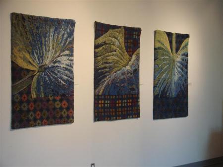
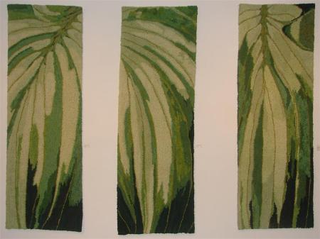
At the far end of the gallery, in direct line from the entry, are three large hooked hangings inspired by hosta leaves. They engage the entire wall with their soft new-green colour, six feet high, 27 inches wide each. They belong to each other, like triplets . Not that each is identical, but the colours and the method of working are the same; and together they describe a greater whole than the parts individually do.

These are called rugs, but I would hate to see such fine, detailed workmanship put on the floor to be walked on. Each is composed of strips of fabric cut into narrow strips which are hooked into the linen base from below, surfacing on “the right side” as loops no higher than 3/4 of an inch. By the way they are pulled up from underneath, they can be twisted or organized to lie parallel to each other or in circular patterns and this creates tactile passages of great visual interest. The attention to such  detail is what makes these large works sing.

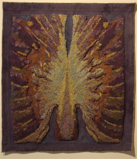
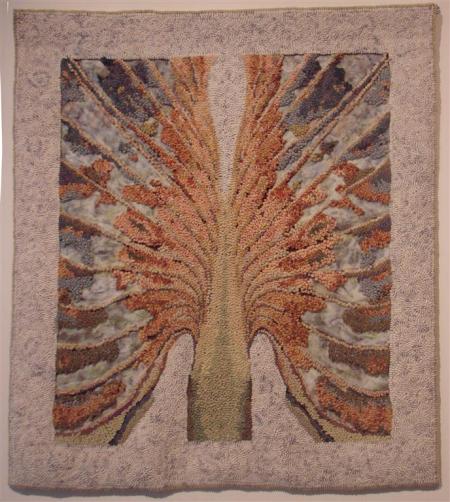
Michelle Sirois-Silver is the artist and this is her Hosta Series number 2.  In this series, the plants are alive and well, unlike her Hosta Series 3 where Sirois-Silver explores the decay of the plant as it comes to maturity and then returns to the earth. In Series 3, the colours change to autumn rich rusts, soft tans and reds with deep  blue shadows; then just as the plant collapses into more muted colours, the soft beiges and browns like dry earth that it is about to join in the birth-life-death cycle.

Sirois-Silver says, “Love Decay Repair reflects my philosophy about art and craft and the seamless integration of traditional and contemporary design, techniques, practice and attitues. Applying and integrating unexpected materials and techniquies into hand hooked work has always intrigued me. In the “decay” pieces, the surface of the leaf begins to disintegrate, taking on a vulnerable quality. The colours are dull and muted. Tears and cracks begin to appear on the surface and new materials and layered techniques such as hand stitching, needle felt and machine stitching are used to depict aspects of decay and repair.”

I like to look at art work without reference to the artist’s intent and explanation. It allows me to feel, instead of analyzing. It helps me integrate the whole rather than to deconstruct. Having said that, I declare my deep interest in the constructive or creative process that is involved in making art. It is for this reason that, of all the works on display, I was spell-bound by the documentation that was tucked on a plinth beside the gallery attendant’s desk.


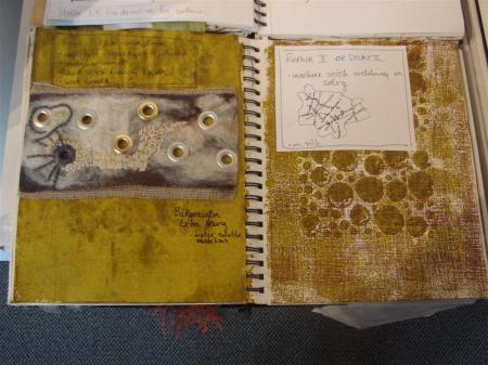
In two books, journals really,  Sirois-Silver collected her lively samples of colours, her explorations of composition, texture and tone. There is page after page of sketches with variations on her theme. There is an awesome display of creativity. .

The drawings are fresh. The ideas are recorded not only in pen, pencil and paint but in swatches of fabric, trial bits of hooking, buttons, fabric, threads and yarns.. You can see some of her visual art process. This, I think, is absolutely wonderful.Imperfect. Living.  Engaging.

I was very thankful to see these, precursors to the fine work that she has conceived into perfect, flawless wall hangings.

These are still on display until October 13, 2012, so if you have a chance come to see them, or look for her news on her web site:

http://www.michellesirois-silver.com/

Marouflage

June 19, 2012

River God, Kristin Krimmel, 1979,  9.5×12 inches, oil on board

I went looking on the Internet this morning for a definition of marouflage. I had hope to send the information to my art dealer friend in Vancouver, but the best information that I got was all in French in technical terms and I didn’t have the oomph to translate all that.
I used the marouflage technique in painting in France during my studies at Art School; then tried to explain it to someone in English. I’m finding various definitions, but not as limited and specific as this one.
For me, it’s a technique whereby one glues a secondary surface over a support (canvas or board) and then proceeds with painting. I was using a marouflage of paper on marine ply, but could as easily have been using paper on canvas. The purpose was to provide a smoother surface and to eliminate or diminish the effect of the support surface (the weave of canvas, the grain of the wood) and control the absorbency.

I began with a complicated technique using rabbit skin glue and plaster of Paris. First, the glue (available in granulated form) was heated with water to a fairly liquid, smooth consistency then painted on the board.  A layer of kraft paper was then placed on top of the board, and a second layer of glue brushed on. When this concoction dried fully, a second mixture was applied made of the liquid rabbit skin glue and plaster of Paris. It provided a white, home-made gesso that formed the ground for the painting – the layer that the paint would attach to.

This white layer was dried then very smoothly sanded. The process was repeated a few times until to a polished surface white surface was achieved.

Figure in red, 1979 Kristin Krimmel, 12 x 12 inches, oil on board.

I was a devoted student of the classic techniques and could be found many evenings brewing up my mixtures and preparing lots of panels so that I could work on them the next day in the painting studio. If I wasn’t preparing mixtures, I was delving into any books I could find on technique.

I came late to the process. I had studied in Vancouver and received a teaching degree in Fine Arts, but I felt woefully my lack of confidence both in my drawing abilities and my knowledge of painting. After four years of teaching and several years of getting my life in order, I had an opportunity to spend a year traveling and I chose to do it by living in Rheims, France and going to the regional art school. That I ended up staying four years at the school is a whole long other story.

Being in an art school allowed me to explore what I already knew and to add the education that I thought I was missing – the classical techniques and the draftsman-like ability to draw or paint things realistically.  In the end, I came to terms with my inability to draw photographically. I even eventually understood that I didn’t have to do so in order to create good art.

Sometimes there are clouds in one’s life. We think we are being deprived of something and the whole world will fall apart because of it. The professors didn’t know what to do with me because I was already an art teacher, so they felt it would not be appropriate for me to learn the way the others were learning. I was proscribed from the basic drawing classes – from classic plaster casts, from perspective lessons and so on. So I sat in my corner of the studio and turned inward, building on the lessons I’d had in university back home. I felt deprived of what I had come to learn.

Instead, I embarked upon some marvelous journeys of discovery. I read everything I could get my hands on, spent hours in the local museum and the Maison de la Culture which brought in very good shows.  My art history prof set me up with the Dale Carnegie Library (yes, this mid sized town in France was given a library by the philanthropist just after the World War I, and was constructed in magnificent art deco style) where I was allowed to handle the original manuscripts housed in their collection.

I was introduced to Mademoiselle Voisin, a lovely elderly lady – she seemed old to me then, but I must be her age now, it’s frightful to think of it. She was the docent for the very important cathedral in Reims – a Gothic cathedral which was the place where all French coronations took place from medieval times until the revolution in 1789. She had a wealth of information about the cathedral and knew all of its esoteric secrets that she delighted in telling. In addition, she collected foreign students around her on Sundays for tea and delighted in feeding them cakes and cookies while encouraging conversation in French and the making of friendships.

I was a model student. I was there at eight in the morning and left at six at night (with a good French break between twelve and two for lunch). Two days a week, I came for evening figure drawing classes. When I went back to my bare apartment, I continued on with my projects and mixtures and experiments until late at night.

I am essentially a lazy being. Maybe we all are. Eventually, I became tired of the long process of preparing my boards with plaster. I thought to myself, why do we need so much plaster? I started to prepare them simply gluing the paper on and forgetting the plaster.  It worked just as well for me, and I was able to paint more and prepare less.

Three apple trees, Germany, Kristin Krimmel, 1979, 24 x 17 cm, oil on board

Marne Vineyards, Kristin Krimmel,  1979, 17×24 cm, oil on board.

It was a very productive period for me, and a lovely way to paint.  Who knows? Maybe I will come back to it.

A selection of Kristin Krimmel’s paintings are found on her website at www.kristinkrimmel.com


Framing

November 21, 2011

I sometimes rescue paintings from secondhand shops or thrifts – originals that people have junked, not knowing what they have. Many are anonymous. I can’t figure out the signature (which is a good reason in favour of clearly printing one’s name when signing an original work of art).  It’s amazing what you can find. It’s also amazing what you cannot find – like any information on the author of the work. If anyone can help me out on that front, please do so.

Sometimes they come with framing and sometimes not.

I found a subtle watercolour portrait marked Don Quixote, very sensitively done, about six months ago is a beat-up black frame with a hand cut mat around it. The image is done in loose watercolour washes with blues for the shadows and warm tones of peach, rose madder and yellows in the warm tones. The eyes are beautifully drawn and the mouth and nose sensitively described.

Signature not clear: Kjariscal or K. Jariscal? Don Quixote, 2000. watercolor

“Never fear!” I thought, “I’ll just re-mat and re-frame it.

Yesterday I had the opportunity to take it out of it’s frame. Oy vey!

It’s backing was a dusty, dirty pulp board – the cheapest kind of cardboard with no refinement whatsoever and prone to picking up moisture. It was full of acid. The mat wasn’t acid free either. Where it had touched the painting, the watercolour paper was going brown. Yuck.

It was taped in with brown paper tape – kraft tape, it’s sometimes called. The backing was nailed in with rusty nails. I don’t suppose they were rusty when they were first tapped in there.

This is just a reminder – a cautionary tale. It just costs a small amount more to buy acid free matting and backing; or to use barrier paper (an acid free paper that separates the work of art from a cardboard backing).

An acid free framing will last a lifetime or more without losing its crisp whiteness; the non-acid free will be brown in two years and spoil the appearance of your gem, not only dulling the framing, but eventually attacking the work of art itself.

My new acquisition is now looking crisp and proud in its new frame.

My favorite custom framing place is Final Touch Frames in Vancouver on the corner of  4th and Quebec in a blue warehouse space. They are reasonably priced; and if you have works on paper that need mats in the smaller sizes, there are a lot of pre-cut mats that might suit your work.

Intent

November 30, 2010

“I don’t really like them. What’s your intent? ” asks Mrs. Stepford next door.

Since I came back from a vacation filled with visits to contemporary museums and galleries, my art production has taken a 180 degree turn around.

“I don’t always know, when I start something new.” I answer. “I start intuitively. I know I want to accomplish something, but I’m not sure what. I’m just mucking around with paint. I have an idea what it might look like and an idea of how I will achieve it, but how I get there, in the end is much to do with how the paint works with me or against me. I put it on and manipulate it. I know how watercolor paint reacts with its surface and I hope to control it but that doesn’t always work and sometimes I have to find a way to get around something that happened during the process that I didn’t expect.”

“You’re painting sidewalk cracks?” she says, not really in disbelief, but nonetheless with some concern that this might not be too serious or that my intent might be spurious.

“Not sidewalk cracks. They are concrete floor repairs that I saw at the Musee d’Art moderne et contemporain in Geneva.  In fact these are realism.  They are paintings of something I have seen. They are modern found drawings, interpreted. ”

“Are you going to put one in the current group show?”
“Of course not.   They won’t fit in a Christmas show. Especially not a small works show. They all have to hang together. They have to be in context or they won’t be understood. It’s not that each one can’t stand alone, it’s just that the intent is clear when the viewer can see the context of them; that it’s not just throwing a paint pot at the paper. Each one is a specific discovery of how the paint flows but each is also a study in placement and spatial relationships. ”
“Think about Rothko and Jackson Pollock. One of their paintings stands alone now, and magnificently, I might add; but the first ones? Without seeing that they all spoke together, a single one would seem incomprehensible. It’s the context that speaks. ”

“True, too true,” concedes Mrs. Stepford.

“It’s a real leap of faith to go out on the edge like this. I like it. It’s not really comprehensible to myself yet. I just do it, knowing that I have a vision and an intuitiveness working for me and I have to follow it until I’ve seen it to a logical end.  It’s an exploration. I’ll try to explain it afterward. But right now, I’m just painting and I stop when it seems right.”

“You are getting better at this,” Mrs. Stepford says. “Before, you couldn’t even tell me what you were doing. Now at least you are trying to put it into words. This is a step forward.”

Mrs. Stepford is my devil’s advocate. She pushes me to express myself. She’s a great critic, in a positive sense. She doesn’t let me get away with drivel nor saccharine work. If it borders on it, she will push me into defending myself. It makes me examine what I”m doing with a fine tooth comb.

In fact, I have been very resistant to putting my intent on paper. I think that the work should speak for itself; that if words are necessary to explain it, then it has failed somehow. And yet, when I was recently traveling and absorbing the work of many contemporary artists whom I had never heard of before, I was glad of some explanation to help me understand what they were getting at.

My sister, also an artist, is staying with me for a couple of days.  We were driving this morning and had time to chat about our art work.

“I don’t understand why you didn’t want to connect with that gallery in Santa Fe that was looking for some abstract work. You do some pretty good abstract stuff. Why didn’t you send it?” she asked, then added, “I guess you had your reasons, but it seemed like such a good opportunity, and to waste it…. But you don’t have to tell me. ”

“That’s not a problem,” I reply. “I haven’t worked seriously for twelve years now. I don’t know where I’m going. A gallery needs to have a body of work to deal with. They have to promote an image. It has to be a vein of work that you can continue to produce in. I’m not there yet. I don’t know where I’m going or which of the various things I’m currently working on that  I will be able to continue on in. I have between ten and twenty works in that vein of metallic ink drawings that you like,  but they are old. I don’t know if I could keep on with it. And I want to produce a whole new body of work, something I can get my teeth into. I’m not there yet. I’m still fishing around with what direction I will take.”

“OK. I get it,” she answers. “I understand.” And we dropped the conversation.

Words. Ideas.

The world of art expects us to explain ourselves, to validate our work. I find it difficult to find words that don’t just feel hollow to me.  It all boils down to intent.

If you don’t explore, you don’t find something new. If I knew what I was looking for, precisely, it probably wouldn’t be interesting anymore.  I just have to keep painting and practicing. Something valid will come out of it.

Val Robinson 2

May 23, 2010

Val Robinson with her painting, BC Fireweed #3

From April 28 to May 16th, Bette Laughy and Val Robinson showed at the Fort Gallery in Langley, B.C.. Unfortunately I was travelling at the time and didn’t get in a timely blog notice of the exhibit.

Originally I posted information about Bette, but I didn’t have much information about Val and no photos.  Tonight I saw Val at a meeting and she forwarded some to me. I decided to do a separate post on her work and here it is:

I was there for the opening. My first impression was of Val’s big juicy canvases of wildflowers. They are about 3 feet by four, maybe larger. I’m going on memory here. The technique is impasto and expressionist.

She loads her brush with juicy paint and manipulates it in fresh daubs that define her imagery. In this first image, BC Fireweed #3,  there is no doubt that this is a tall, impressive flower with bright pink petals. The supporting stem waves in the wind,  with the red, rust and gold colours changing the length of it as it catches light. There is fresh air and vibrant joy in this work.

There were two more expressions of Fireweed in this exhibition with consistent verve and colour. The remainder of her images were of British Colombia scenery.

Flowering Sage by the Thomson River, Val Robinson, oil on canvas

In Flowering Sage,  Robinson captures the essence of the Thomson River desertic landscape in the Interior of British Columbia. Along the dusty banks of the river, sage blooms in the spring bringing an unexpected swath of colour to the sandy coloured slopes. It is a fleeting moment in the annual calendar of its landscape, a short vernal moment in an otherwise hot and dry area.  Again, Robinson works with  a liberty of brushstroke and  a freshness of colour.

I like that Robinson is not bound by photo-realism, but finds a way to express the essence of what she is looking at.  There is a generalization in the way she models the forms, but there is specificity in the shapes. Just reading that last sentence makes me realize the duality that is at work here.

For example, in the Fireweed painting Robinson has been specific about the form of the plant, how the individual blooms come away at various angles so that the space of the picture is divided up in interesting shapes. Yet, when Robinson paints, she is not bound by the detail of the plant. A leaf is a  single brushstroke – she finds no need to explain in paint that there is a line of paler light that goes up the mid-rib vein of it. She feels no necessity to paint specific markings on the petals.

Water reflections on the Fraser River, Val Robinson, Oil on Canvas

In this last image, Water Reflections on the Fraser River, Robinson has the same exuberance and a completely different palette of colours.  Here, I sense either an autumn reflection or a sunset one. The shoreline is dark but in the foreground, there is plenty of light, so it has an upbeat feel.

I’m less enthusiastic about this painting. The colour of the grasses doesn’t work for me and they look mechanical compared to the remainder of her image which she has painted as freely and juicily as the Sage and the Fireweed.

Of her own work, Robinson writes, ” I love painting because it gives me the freedom to express myself emotionally with colour —express my interaction with the physical world….  The painting balances me out more in my life.”

She speaks of the fabulous nature of British Columbia and her enthusiasm for painting the scenes and flowers that are the muse for her paintbrush. In this she succeeds well.

Robinson is  a new member of the Fort Gallery and I am curious to see how she  will develop in her new paintings in this sensual, expressionistic style as she goes forward from here.

Raw – Stefany Hemming

May 22, 2010

Hollow, Oil on Panel, Stefany Hemming, 20 x 20 inches

I happened to be down at the Elliot Louis Gallery again last month just after the Stefany Hemming show went up.

In this, her second show at the Elliott Louis Gallery, Hemming is depicting tangles of twigs, roots and vines in swirling masses, often evoking nests, but sometimes just providing huge natural-like pattern fields.

The panels she works on are large and it is sometimes just this factor of size that makes these works remarkable.  The mark making process seems to be so freely made without hesitation as if error and second considerations were simply impossible. It makes for  very freshly executed paintings and on such grand scale paintings, this is both physically and emotionally demanding.

I examined the paintings from afar and from up close. It’s one of my ways of determining the intrinsic value of a work of art.   Does it look as freshly painted  up close as it does far away? Does the pattern read from afar or get lost in a blur? Is the surface of the painting finished or does it lack consistency upon closer inspection? Is there overall composition in the far view; and is there sufficient interest in the near one?

What fascinated me about these images was just that freshness that has been achieved in laying down the paint. It seems to have arrived in one single gestural stroke going round and round. And yet the overlapping of the ribbon-like shapes shows no pulling through of the paint. It’s controlled and meticulous, and there are subtle variations of tone that had to be added in later. It’s a mystery as to how it is achieved.

Hollow (detail) Stefany Hemming, Oil on panel

I suspect that the whole “ground” of the painting is covered with a fairly liquid oil paint of a single colour and then a scraper is used to gesturally scrape through, leaving bands of the under colour to emerge as the figure. Then touch ups must be made to achieve that seemingly-effortless crossing of lines and the clarification of what is forward and what is behind in the overlapping of the ribbon shapes.

Gather, Stefany Hemming, Oil on panel

From a practicing artist’s point of view, the technical process is unique. From an imagery point of view, there has been almost a fad of nest imagery and another of pattern fields.  Hemming’s work surmounts the ordinary through her meticulous process, her gestural freedom and the sheer magnitude of the imagery.

Thicket, Stefany Hemming,  oil on panel

Hemming describes her art exploration as  an ” obsessive, ritualistic, instinctive practice which embodies all the contingency, uncertainty and instability of the real. It promotes painting as documentation of the intangible, evidence of one’s humanity.”

In this,  I can relate that the act of painting of the imagery may be obsessive, ritualistic and instinctive, but the end result has a feel which is none of these. Instead, these large works are quiet, still images.

This is perhaps because the composition is overall. There is no story to tell. The nests are empty; the balls of string static; the branch-like structures do not go anywhere.  As such, Hemmings description of her work as embodying “all the contingency, uncertainty and instability of the real… and … as documentation of the intangible, evidence of one’s humanity,” does not work for me.

There is nothing here for the viewer to link evidence of one’s humanity. The objects that are depicted are tangible and recognizable. There is no message coming through of contingency, uncertainty nor instability.

For me, this is typical example of art-speak – the ascription of esoteric  language  to justify one’s work; and what is written is disconnected with the imagery.

Having said that, I find these works interesting, particularly in terms of technique. They represent a quality of contemporary work that remains at once abstract and representational at the same time. For me, these large works are beautiful for their gestural freedom,  for their timelessness and their stillness.

There’s still time to see the exhibit at the Elliott Louis Gallery,  at: #1 – 258 East 1st Avenue, Vancouver, B.C.

For a greater selection of her paintings, see her work on the web at :

http://www.elliottlouis.com/dynamic/exhibit_artist.asp?ExhibitID=399

Jim Gislason

March 12, 2010

Diva, Jim Gislason, Oil on mesh pinned to canvas

About three months ago, I had dropped in unexpectedly at the Elliott Louis Gallery hoping to see the gallery owner Ted Lederer.  He wasn’t there and his able assistant, saying he might arrive any moment, began to distract me with some of the latest work in the gallery.

It was the first time I had heard of Jim Gislason and ergo, the first I had seen his creations.  She explained his technique whereby he prepares a photomontage of images which he then translates into a photo transfer on emulsive film for silk screening, and then he proceeds to force oil paint through the developed silk-screen. It’s a labour intensive process and it requires a complete fore-knowledge of the final image because, at the point in the process that the oil paint is being pushed through the silk screen material, all has to be done at once.

Since he has differing depths of extruded paint coming through, he needs to know exactly at what place he is pushing through with which colour and a fairly precise amount of paint. That’s all rather technical, so of course I was impressed at the complexity of it. Nevertheless, if the process isn’t in tandem with some meaning, then it’s futile to try to impress someone with the number of layers of paint or the hours it takes to dry.

Detail of paint extrusion. Note the icon of Thor’s hammer from the painting Reveille, J. Gislason

Details of paint extrusion and paint manipulation, glazing etc.

At that time, there were only a few of Gislason’s works and I found them quite engaging. I had to refrain from touching them, they were so tactile, yet every inch of each of the works had something more going on in them. The texture was made up of a lexicon of printers’ symbols mixed with new icons made by Gislason himself. He photographs images he wants to use and then reduces them to a size of the printer’s symbols, mixing up the ready made with his home-digitally-made new symbols, and creates a large mass of them.

From far away, the image looks quite serene – large abstract shapes that glow with colours vibrating against each other, which are filled with details on closer inspection.

So are these paintings or are they silk screen prints?

If they must be classified, I’d put them with the former category. They are, after all, made with oil paints, not silk screen inks. Secondly, there is only one image made each time through the prepared silkscreen, thoroughly dried, touched up with more painting on the surface  and then it is removed from its stretcher bars and the screen with its extruded image and additions of paint  are pinned to its canvas lined exhibition frame.

Framing detail, mesh pinned to canvas

When finally the gallery owner came in that day, I was scrutinizing one of these works and was somewhat reluctant to withdraw from the process of inspecting the details of the imagery. After we had talked, he sent me home with his only copy of a printmaking anthology in which Gislason’s work figures along with an explanation of his ideology. Not only is Gislason an artist but he is a wordsmith as well.  His poems are sometimes part of the imagery and sometimes published beside the work of art.

Last week, the e-mail invitation came announcing Jim Gislason’s latest show and the opening reception and I noted it in my day-book. Not long after, I had a separate e-mail from Ted saying, “If there is only one exhibition you come into town for this year, make it this one. No kidding!”

Fortunately, I had Thursday March 11th available and it was a perfect opportunity to do a bit of gallery hopping with my sister who is in town from Rossland for her first solo show.  I had no hesitation. In fact, I made sure we were there a half an hour early so that we could see the show clearly without others to interfere in either our concentration nor our enjoyment of the imagery.

As guests arrived, Ted came by to say Jim Gislason would be arriving shortly and I just had to meet him. When the two of us met, there was a momentary awkward pause when Ted disappeared.  Jim had no idea who I was and though I had become familiar with his paintings I didn’t know what to expect either.

I explained myself – my admiration for his work  and my desire to write about  artists I appreciated so that good work  could become  more widely known. I talked about the layers of meaning that I was discovering in his paintings. He expressed his concern that people would only focus on the technique and not get the messages built into the work.

Work on paper, Jim Gislason from an earlier series. Note the chevron pattern that occurs here in black and white on the left and in grey and white on the right. This pattern recurs in different colours in many of his paintings.

Although there are a few pieces from earlier series,  the greater part of this Gislason  show is themed, Kings and Queens. In each of the newer images, he represents historical faces of either a king or a queen. The kings and queens, he says, are not mythical people or heads of state, but ourselves, living to the greatest of our potential.

The refusal of Charon, Jim Gislason, Oil on mesh pinned to canvas

He has a strong belief in spirituality gained from wide reading and experience in several religious philosophies, Buddhism being the one that more prominently underpins his work.  I asked about one cross-like symbol, but it was, he explained, Thor’s hammer, or a Mjollnir.  The Longships I and II represent a square-sailed Viking vessel.

Longship II, Jim Gislason, Oil on mesh pinned to canvas

I had to look up the reference to Thor’s hammer later as I was unfamiliar with this – so I am providing this quote from Wikipedia:

  • The Prose Edda gives a summary of Mjöllnir’s special qualities in that, with Mjöllnir, Thor: … would be able to strike as firmly as he wanted, whatever his aim, and the hammer would never fail, and if he threw it at something, it would never miss and never fly so far from his hand that it would not find its way back, and when he wanted, it would be so small that it could be carried inside his tunic.[1]

Besides the spiritual aspect, his references are drawn from various iconography – hand lettering print type, the graphic arts, Egyptian and Greek art, modern day traffic symbols, map making and historical painting references, to name just a few.

Shadow Throne, Jim Gislason Oil on mesh pinned to canvas

For instance, in Shadow Throne, from afar, the figure appears to be dressed in a medieval garment with hoops holding the dress out widely from the body. It is, in fact, derived in shape from Velasquez’s Infanta Maria Theresa of Spain.  Up close, though, the panels of the dress are fashioned from antique half- maps of the globe and other cartographic references,  adding depth and richness to the overall imagery.

Detail from Shadow Throne, Jim Gislason

When I was speaking with Jim Gislason, I realized that it would take along time to delve into all the references he uses.  We discussed this briefly. Though it would enrich my appreciation of his work to know what was embedded in the work, at some point, when the artist lets go of his work, i.e., he shows it to the world, then he must let go all the particulars that he has put into it. Viewers come with their own experiences and knowledge. What may  resonate in their minds may not be at all what the artist intended but that does not diminish the work and may in many instances enhance their appreciation.

Medallion, Jim Gislason, oil on mesh pinned to canvas

Detail from Medallion

This is a show worthy of a good long look. Each time one of Gislason’s pieces is revisited, more is found in it, whether be the connections between the numerous symbols used or an appreciation of the paint texture with its glazes and tactile richness, the added elements collaged in or one of his poems that might clarify the image or conversely add some new mystery to it.

In the end, while I marveled at the technique, the focus on that aspect of them quickly gave way to the intricacy of the imagery and the overall abstraction of them.  My favorite paintings are the ones where I can’t figure out how they were made (even though I’ve been told) and there is a mystery in the content. I’ve added these to my favorite list for sure!

The show is on until April 24th at the Elliott Louis Gallery at 248 East 1st Avenue in Vancouver, B.C.

http://www.elliottlouis.com/
Doin’ the digger

January 14, 2010

I’m on a roll!

Paint is flowing!

I’m back doing my construction work.

Here’s a series of images that culminate in my most recent work. I must say that I’m not 100% sure it’s finished. I’ll have to let it sit for a while, but on the other hand, what I have been waiting for has occurred.

I’ve been waiting for a flow of ideas to come. I’ve been waiting for that blessed artistic state where one idea builds on another, where the ideas come as I am painting. I can’t say that they are tumbling out, but at least they are coming faster than I can get them down on canvas, and I’m preparing canvases during drying time so that there will be another one ready for the next image.

This first image is the underpainting with painter’s tape masking the edges. It helps get sharp lines when you are a traditionally messy painter.That’s the prep stage.

First painting stage,

I’ve established the two positive colours and shapes geometrically. Some of this is painted in masked areas, but the black circles, I didn’t have the patience or maybe the ability, to cut a perfect circle, so I just painted it free hand, if you can call it that when you painstakingly try to ensure you do not go outside the lines. Talk about colouring book technique!

And then, third stage, I take off all the tape and see about the balance. Essentially I have composed this image relying on the spatial relationship theory of composition but I’ve also very faintly lined up the geometric relationships as well and have taken some of the key lines into consideration when I considered placement of the geometric figures.

Like those puzzles where you connect the dots, your imagination can make synaptic leaps to reconstruct the digger. It has all the essential elements. But I’m not sure that I want a yellow background in this. I’d prefer a neutral grey – a light one. So I went about trying to mix a large quantity of the neutral grey dark that I used in the previous painting which focused on shapes.

Impossible. In some additions of paint, it looks green, in others it looks brown. I add a bit of this, a bit of that. It’s not working. Finally I decide to go with what I’ve got. I add a lump of yellow ochre to warm it up and it’s not bad. Not perfect, but acceptably neutral.

I start to paint and a funny thing starts to happen. As I am painting, getting up close to the red, the paint colour perceived as neutral starts to become an eye popping lime green. I can hardly paint as the effect of simultaneous contrast starts to play. I get this halo shimmering on the edge, and I can no longer see where the edge is as the eye refuses to compute the two adjacent colours together.

I must say this is probably the hardest painting I’ve done since, as I’m painting, the edges are starting to move. And no, I haven’t eaten anything funny! It’s difficult and amusing at the same time.

I’m tempted to keep the yellow underpainting in some spots and then decide that I will complete the grey background throughout.

By evening, I have covered the entire painting in the grey, leaving only these red and black shapes of the digger, but it’s not even. I was hoping to escape having to mask off all my red and black shapes, but I’m out of luck. When I simply paint around without the mask, I get these halos of scumbled paint.

Scumbling is a method of using your brush on its side with the flat of the bristles, not the point, which de facto give you a textured, messy kind of texture also called scumbling.

I get a call from Mrs. Stepford to come over with the new creation and I go, toting a big green plastic bag with the painting in it and a book on mandalas that I got in some second hand or thrift store. I’m going to give it to Mrs. Stepford because she has just created a school program for all grades that is based on making mandalas. The green plastic bag is a necessity because it’s Wet Coast pouring rain.

Her two painting students are there on the point of leaving,  and Mr. Stepford is hanging in there, signing off his latest stunning photograph which he is giving to the two women.  Mrs.  commands me to bring out the new painting and we all discuss its merits.

I make apology for the scumbling and the halos, but both Mr. and Mrs. rave over the scumbling.
“Dont change a thing!” she exhorts. “I agree!” adds Mr. Stepford. They like the texture and think it would not be improved if I flattened the background to a single tone and hue.

I promise to put it away for a few weeks before I do anything more to it. I had another vision in mind, but I can still try my other vision on another canvas and keep this one.

So here it is at its final stage (for now).

Hitachi Digger – painting progress

January 11, 2010

Hitachi (variation 1, shape), acrylic, 16 x 20 inches

Every little change becomes an artistic decision.

The Hitachi digger has been up on my wall in all its garish glory, an intense cerulean sky, a cadmium red light digger cut with some cad yellow. It’s eye-popping.  It’s an under-painting.  It’s too hard on the eyes with the simultaneous contrast operating at full force, But where to go next with it? What did I want to do with this one when I set out? After several months, I’m still stuck, looking at this rather blatant drawing in colour, not knowing what to do.

Every change in colour shifts the balance, creates new values of weight.

When the gallery dealer came, he had some wry comment about it, then praised the one in greys for its subtleties. Has this influenced my decision to add some grey? And if some grey, then how shall I mix that grey?

I pulled out my painting supplies that had been hidden under the studio table and set up to work in acrylics again. Everything had been put away for the Christmas festivities.

I’ve accumulated some supplies from garage sales and demos at economical cost. The tubes need to be used up; so I started with a Stevenson’s Burnt Sienna and some Manganese Blue but the mixture turns out looking too green a grey. Greys are the hardest to mix because they are so affected by the colour you put them beside.  I had a lump of left-over white from my palette the last time I painted which I kept in a tiny jam jar with a skim of water for just this kind of mixing.
If you put a neutral grey beside some red paint, it will take on a green cast; and if you put a neutral  grey beside blue paint, it will take on a yellow cast to it; so the mixing has to take this into account. It alway takes on the  cast of the  colour opposite from  it on the colour wheel. It may look perfect on the palette, but you place it beside something else and the colour shifts!

Armed with this grey mixture, and lots of it – one doesn’t want to run out mid way and have to remix some paint; it would be impossible to match –  I painted in some of the digger parts in dark grey trying to maintain the fine red lines that were the first definitions on this image of the location of the various parts of the machine.

Here it is with the first grey put in.  It has become heavier at the bottom with the grey and not the ochre. It was insubstantial, floating in the air before, and now it is grounded.

I had to chastise myself as I started to make this painting more and more realistic. I struggled against my own nature when I force myself to abandon the detail and search for the major shapes. I was tempted to use all four colours and then realized that I was tripping down the realism path again. The only purpose of the yellow undercoat is to warm the painting from below.  In the end, I used the three major colours and ended up with this.

Then I went over to Mrs. Stepford’s for a second opinion.  She’s a real treat because she can put words to my paintings that I never thought of and then my paintings sound so brainy, somehow. It’s gratifying and I learn something about myself and my painting and visual thought habits

We discussed the ambiguity of the sky colour and the lack of a definite ground or horizon line. We discussed the weight of the dark colour massing at the bottom and whether or not it adversely affected the overall imagery. I went home to struggle with it a bit more.

Paintings are difficult beasts. Especially pre-meditated ones. Everything has to work together at the the same time

One of my wandering thoughts was “why do I say that I want to do fresher looking paintings, more direct and then keep on tidying up everything until it no longer looks free but belaboured”.  What is the fine line between free and sloppy? What is the defining criteria between child-like and childish? How far can one push it before realism becomes interpretation? Or becomes abstraction? I was plowing through the borders of these things without any answers.

I was remembering one of the very elegantly painted works of Kai Althoff whom I wrote about quite some time back. One of the paintings had this simplicity of shape, but his paint was impeccably even and his lines were equally wide throughout. It seemed almost as if it had been printed, but it wasn’t. It was hand done, but so perfect. Mine’s not perfect. The lines are varying in width and sometimes thickly, sometimes thinly painted. They vary from deep cadmium red to cadmium yellow. Could I just leave it like that?

My shape colours are not flat and even. I’ve allowed the underpainting to show through. I like that because it gives a bit of texture and the paint sometimes glows with the undercolour peeking through. And yes, I can do that. To leave it thus is an artistic decision.

And this is where I have left it. I’ll sit with this version now and see in a week or two if I can live with the work as it is, to date.

Next, I start with this underpainting and second draft of a visual idea.

It’s about metamorphosis. I found that the digger looked quite like a heron with a long red beak and the cables much like river grasses. At this stage, the colours are too flat, too transparent, too much like first draft. There’s no refinement.

I worked at building up the reds, giving the breast of the bird a better shape through modeling it in different tones of red and yellow and this grey which is left over from the previous painting.

I think it’s important to carry over colours or use a limited palette. It ties a group of paintings together.

There is an unfortunate shape  of red behind the Red Crested Digger. It was originally from the cab shape of the digger. Now I want to obliterate it. In doing so, I lose all traces of warmth coming from the underpainting, and the cerulean blue mix that I use to overpaint is a shift from the previous cerulean and titanium white. The whole sky has to be repainted, otherwise the patch will stick out like a sore thumb, but it’s a good trade-off for the overall compositions of the painting. I’m pleased with that change.

And now, the series is beginning to come clear to me. In each painting I am exploring not only the visual reality of the digger but the abstract qualities that drew me to it. And from that, there are new ideas coming to me. This one is about metamorphosis and in graffiti like letters, I spell out that clue in the foreground while the Hitachi graffiti graces the cerulean sky. These markings provide balance. In the final version, below, I have added  red into letters of the grey foreground.  It helps pull the eye into the remainder of the picture and brings more warmth into the image.

It has already given me an idea, even more abstact for the next stage – not on this painting. It’s done. I’m ready to start a new one!

A lesson in leaves

October 29, 2009

Fragments - Leaf -  small

I spent the afternoon out looking at leaves. Well, really, I was raking the magnolia’s gamboge dress that that she left strewn all over the floor. She’s going to be mighty cold without clothes on this winter.

The cedar trees that dried out severely during our summer drought went dancing to the Aolian harp this week along with the dogwood and the hazlenut tree. It shook a might layer of dried “needles” out from underneath its boughs. It made a beautiful burnt sienna carpet on the ground; but unfortunately it has a growth inhibitor that prevents other things growing and if the debris is left, it seeps into the soil and kills all the other struggling plant forms.

So I was sweeping up and containing all that stuff into green garbage bags to go to the yard waste dump and all the while I was looking, looking, looking. Those cedar bits are so-o-o-o-o beautiful – really graceful forms; and the magnolia leaves were turning from their pure yellow of only a few days ago. Burnt sienna was seeping out from the veins. Grey dots were forming. Some had been underneath the others for a while and had turned solidly brown or, the ones I pulled out from under the cedar hedge, were black. These black ones must have survived a winter and a summer, hidden rather deeply under the hedge. All these colours in all the variety was a real pleasure to look at.

When I came in, I spent some time sorting photographs. With digital cameras, we aren’t so discreet about what we take. After all, we don’t have to print them all, so we, or should I own up here and say “I”,  take several where I might only have taken two in the past.I have thousands of photos now and my computer is clogging up with them all. I need to get some off the computer.

I came across this lesson I gave to one of my students recently about positive and negative shapes. So I”m going to do one of my little ten minute lectures here on elementary positive-negative shape considerations.  It is inextricably linked to concepts of composition.

Pos Neg shapes sketch small

This page is a series of thumbnail sketches for illustration purposes.

See the little rectangle in black with the white P in the center. The white is the positive shape, a circle. Everything that is left is deemed the negative shape.  It’s a rather boring composition, really. If you’ve read my other blogs on composition, you will know that this gives a single figure in a rectangle which makes it difficult for the eye to go anywhere else in the picture and so it becomes tedious to look at the one spot and the viewer will quickly tire of looking at the work.

In the next thumbnail just above it, there is a shape that represents a head and shoulders plus background. This is a small improvement over the first example. At least the black figure touches the outer edge and so the eye can easily work from left to right, right around the figure and out the picture on the other side. It begs the question: will the viewer take the time to stay and look at any detail in the picture, or has the artists simply given the viewer permission to quickly enter stage left and exit hurriedly on stage right with out much attention in between. The negative space in this image is the white background.

The bigger sketch of the figure with shoulders drawn down to the bottom line, with a space between the arms and the outer edges, a familiar portrait style,  just illustrates that by doing so there is still only one negative (background) shape. One can vary the shoulder tilt or add a hat with an angle to avoid a too-symmetrical effect.

Many portrait artists through the ages have used this simple bust-plus-head model of composition.  If you have ever gone through the Rijksmuseum in Amsterdam, you will know what I mean. After a short while going through the portraits, you stop looking and speed up your tour through, looking for something a little more engaging (and of course, there is,) in other galleries of the museum.

In  the thumbnail with two figures, it illustrates that you can use a shadow of the original shape to make the background more interesting. It’s been a while since I did these notations, so I had to think about it a bit. It’s not obvious that it represents a figure and a shadow. So I would add, if you put in two figures and ensure that they are at different heights or wearing different colours, or vary the composition in some other way, you can make your positive-negative balance more interesting.

Talk about forgetfulness, I’m reminded of Robert Browning, the 19th Century  poet,  who was asked what something meant in one of his poems.

He replied, “At one time, only God and I knew. Now only God knows.”

I’m trying to figure out the remaining thumbnail sketch. It looks somewhat like a dog.  But with a V neck.  I know what P stands for in this lesson, but what does S stand for? Why would a dog be wearing a V-neck pullover? And is that a necklace, the wavy stuff? With this inability to explain myself, I ought to stop right here! But being verbose me, I have a few more relevant things to say and one more picture to show.

Fragments - Leaf 2 small

I asked my student to draw a branch being particular to notice the direction that the leaf grew off of it and noticing the spaces between the leaves as an integral part of the composition. When she was done, I took a few pictures of the drawing to show how cropping a drawing can improve the overall disposition of objects in a composition.

As an aside, note the overlapping leaves. It’s one of the principal ways to indicate perspective. It may sound obvious to those of you have been painting for a long time, but people struggling with representation often need to have this pointed out.

As an outcome of this lesson, I thought that my new student did a great job of finding a good composition and a variety of negative shapes.

Now back up to the top drawing, the one that opened up this blog.  I quickly sketched these three leaves and enclosed them with a line denoting the picture plane.  The leaves do not touch the edges.  The point is, though, that there is an implied entry to the drawing via the left hand side and an implied exit on the right hand side (after some looking about the various shapes and spaces). If you get an image close to the edge, it acts as if it is touching the edge. A pointy shape will work better than a round one in making the eye take a synaptic leap across the vacant space.

In this drawing I also illustrated how shading can accomplish some of the interest in the “negative” shapes and can heighten the positive shape by doing so. I liked this drawing well enough that I think I may paint it, but in colour!