Apologies

April 13, 2013

I’m having he worst time trying to post on WordPress from my iPad for some reason. When I edit a spelling error, then the whole s Rene freezes and prevents me from typing; I’ve tried all kinds of work-around s and have not yet found a solution,  It’s so frustrating and time consuming that Inhave abandoned trying to record my journey here. Sorry folks!

Kristin

No more sleeps

April 8, 2013

The journey begins. Galina is coming to take me to the airport. The baggage needs one more edit – it’s too heavy, too full.

It’s always this way when I am carrying sketchbooks and pigments for the imagination.  One by one things come back out of the suitcase. I’ll buy the paints there. The paper. It doesn’t seem real some how . It won’t I until I’m on th e plane, racing from one gate to another.

One by one, out go the things I can do withou t – charcoal, light but too messy. I’ll buy it there; tubes of water colour (heavy metals); a sketchbook ( how many does a girl need) – and so on and on.

There are last minute things to do. gotta run!

Disappearing Species

December 14, 2012

Mausoleum: Red List Lament, Doris Auxier, 2012, Metal framework, piano scrolls, vellum, paint, light box.

Is it a temple or a mausoleum?

Disparate elements in this installation create an eerie, warm feeling. From a distance, I felt as if I were being drawn into a Zen temple with oriental scrolls marked with calligraphy. A closer view reveals that the scrolls are not oriental at all, but player piano scrolls with sentimental words to old songs printed on the side to match the tempo or the music as it plays. The words, like Asian writing, read from bottom to top, contrary to our usual top down habit of  reading.  Hanging between these scrolls are ephemeral charcoal drawings of plants made on vellum or parchment paper, glazed with beeswax to create the same golden timbre of the piano rolls. They glow slightly. An odor of beeswax has all but been erased but lingers gently.

In the centre of the arrangement, there is a four-foot tall glass container lined with fiber glass insulation and lit from the interior. It has the feel of a stele or a mortuary box. It’s as if it contains a soul. A dying soul.

Detail, paintings on vellum, with beeswax

The piece is, in fact, a lament. It documents 14 species of native plants that have almost become extinct in the Gary Oaks area of Vancouver Island, near the city Victoria. They are red-listed – a designation that is assigned when a plant becomes endangered and threatened with extinction.

Doris Auxier, the artist of this deeply sensitive installation, is keenly involved with using her artwork to alert viewers to the ecological, environmental situations concerning endangered species.

She explains:

“While player piano scrolls are still in existence, the piano itself is rare. This makes the scrolls that were dependent upon the piano/infrastructure/system virtually useless, existing mainly in antique shops and museums. Similarly, the plants on the red list can be grown from seeds saved from the plants, but they can’t survive if the ecosystem is destroyed. The plants become museum objects that exist in research gardens and other limited environments.”

Mausoleum: Red List Lament, is a reflection on nature, displacement and loss.

Detail, charcoal on vellum, beeswax

Accompanying Auxier in this exhibition, print maker, Edith Krause has created a series of prints beautifully constructed, on the same theme.

She too laments the loss of habit, citing the importation of non-indigenous plants whose incompatibility with the existing ecosystem results in a disastrous  destruction of the local plants. When an early settler, Scotsman, planted a bit of broom he brought with him from his homeland – that hardy shrub with a cheery yellow flower – little did he think that the plant would aggressively reproduce to the point where it would rob the delicate native plants of their habitat. It’s the well-known “Butterfly effect” where a tiny decision ends up playing havoc with the environment, inflicting irreparable damage.

The Butterfly Effect No. 1: Western Sulphur, Edith Krause, Screen-print, digital print, acrylic, plywood, hardware

Each of her art pieces consists of a Plexiglas panel suspended a half-inch in front of a secondary image on plywood. The base image on the plywood appears to be a close-up view of butterfly wing, while the suspended image in front of it on Plexi is a map of the Victoria area where loss is occurring.  Superimposed on the map in black is a screen print of one of the invasive species causing the decline of the Garry Oak; like an obliterating force.

These “prints” are beautifully executed. The effect of transparency gives depth to the images. The three-dimensionality produces delicate shadows. It confirms the fragility of the plants, while the map imagery underlines that the city has superimposed itself upon a natural setting, disrupting the natural order and contributing to the demise of endangered species.

This is a thoughtful exhibition worth seeing. It’s at the Fort Gallery until December 2nd, 2012. The address is 9048 Glover Road in Fort Langley, B.C. Hours are Wednesday to Sunday, noon to 5 p.m.

Small Wonder!

December 13, 2012

Image

Low Tide, Bob Wakefield, 11×14. oil on canvas

Image

Prada, Bob Wakefield, Oil on Canvas, 14×18 inches

Normally, I wouldn’t post a painting complete with frame, but these two paintings just beg for frame recognition. The paintings by themselves would just not be the same.

Bob Wakefield is one of about  20 artists in the Fort Gallery artists collective in Fort Langley, B.C. The show Small Wonder! is the pre-Christmas, salons-style exhibit that allows the artists to bring out their non-series paintings, their small works, trials, sketches, etc. They are beautiful and they are affordable.

Wakefield was originally a student of Susan Falk, who is also with the gallery, and they work in thick impasto and expressionist style.  Falk’s is showing some farm-related imagery – a painting of a red barn, a large drawing of a sunflower, and a painting of her beautiful little iris-rimmed pond that is just big enough for a small row boat and a gaggle of geese. Pond Study is loose and dramatic with autumn colours contrasting with an ultramarine blue.

051 (Small)

Pond Study, Susan Falk. 24×12, oil on canvas

033 (Small)  034 (Small)

Two paintings from the series “From the bus: Coquihalla“, Veronica Plewman, each 6×8 inches, acrylic on board.

Plewman is showing 6 paintings from the series, “From the Bus: Coquihalla”.  The paintings describe the area near Merritt and Kamloops in British Columbia where the highway cuts through the mountain pass on Highway 5.  Plewman has captured the wonderful quality of colour that sings through a snowy landscape where, to the unschooled eye, one might be excused to think that there was just white and dark. She paints the blues, rusts, ceruleans and yellow greens that sparkle through when a bit of winter sunshine illuminates the hills. In these small paintings, she manages to describe the mightiness of the mountains and the detail of soft fog captured between the hills or a stand of bare alder with their raw umber branches. These are simply jewels of craftsmanship and vision.

039 (Small)

Search, Bloom, Shine, and Drift,  four prints by Edith Krause, , approximately 9×12 or 10×10 inches.

Several of Edith Krause’s small prints from “The Butterfly Effect” series are available in the show. I wrote about them recently so if you would like to see samples of those, go looking back a post or two.  Search, Bloom Shine and Drift are new works to the gallery and have quite a different feel to them. Krause creates prints with great attention not only to the inherent ecological message but also to the texture and surface qualities of her work. She pays great attention to finishing detail. These works are simply  perfect in craftsmanship.

050 (Small)

“Inukshuk” Pat Barker, Acrylic and Mirror on board. Approximately 8×8 inches.

With Inukshuk, Pat Barker gives us a preview of her upcoming show. She experiments with materials and includes bits of mirror in her design, enhancing the feeling of ice and snow.

040 (Small)

Carolina Poplars, France, Kristin Krimmel, gouache,  6×8 inches approx,

There are a number of works by artist Kristin Krimmel. This early gouache of hers describes the lines of trees along the roadside in France in the Department of the Marne.  Another landscape she offers is a watercolour of a farmhouse near Montpellier. It’s inspiration in style is an adaptation of the pointillists method or working. By overlapping small strokes of pure colour she blends and nuances the image to represent the special heat and light qualities of the Languedoc region on the Mediterranean.

042 (Small)

The Mas, Kristin Krimmel, watercolour on Arches paper

The surrealist of the group, Olga Khodyreva has contributed this fluid image:

062 (Small)

Drama, Olga Khodyreva, Gouache and ink on Paper. 12×12 inches.

It’s reminiscent of Joan Miro, Alexander Calder and Picasso with it’s tumbling figures.

059 (Small)

Winter wandering, Jennifer Chew, 8×10,  Velum and charcoal on wood panel.

Winter wandering describes fine branches emerging from snow. There is a delicate quality of calligraphy in this finely composed drawing.

FH Dempster Highway #1 (Small)

Salmon Glacier, Fiona Howath, 11 x 14, Silver Gelatin photograph

FH Fallen Giant (Small)

Fallen Giant, Fiona Howath,  Silver gelatin photograph, 11 x 14

Fiona Howath is an upcoming photographer whose work, in this exhibition, focuses on the natural landscape. She has crisp focus and  captures exceptional lighting. Detail is as important in the foreground as it is in the back. I particularly like the feathery quality of the ferns in Fallen Giant and in Salmon Glacier, I find the light/dark composition is excellent with the cloud, white above the mountain, casting dark on its slopes and brilliant sunshine delineating the character of the geological formation.

There are lots of paintings from each of the artists. As one is sold, it goes away with the purchaser and another gets put up.
I encourage you to go see the show and maybe even treat yourself to a painting. They are reasonably priced and there is lots of variety. Also there are several smaller items – greeting cards by four or five of the artists, fused glass tree ornaments (Judy Jones),  chap books and other small gift items.

Also featured in this show: Richard Bond, Lucy Adams, Doris Auxier, Fiona Howarth, Dorthe Eisenhardt, Judy Jones.

The location is 9048 Glover Road, Fort Langley, B.C. The gallery is open noon to 5 p.m., Wednesday through Sunday, and the show closes Sunday December 23rd.

Don’t forget to check out the web-site too:

www.fortgallery.ca 

October 18, 2012

Spectacles, Kristin Krimmel, 36 x 36 inches. Acrylic on Canvas

The show is just about over. I’ve had great feed back. Clearly the favorite painting is “Spectacles”, three panels forming a 36 x 36 inch triptych. Next comes “Hallelulia!” amd then the renamed painting “Grow Op”.

Hallelulia!  Kristin Krimmel, 2 panels creating a 36 x 36 image, acrylic on canvas.

There’s a story to tell here.

I did the larger 24×36 inches portion and it always seemed not quite complete. I kept thinking that it looked like a musical score with the cables curling along like musical clefs, and the wires like the staff one writes music on. My piano music was not giving me quite the image I wanted so I asked my friend Karen who taught Voice lessons and choral music. She brought me a beautiful collection of Handel’s works for voice which included the Hallelulia Chorus in it. What you see on the second panel to the right is the first chords of the Hallelulia Chorus.

When next she saw the painting, I had created the second part enought for her to see the structure of it. “Why,” she asked, “had I made the bass clef like that?” It was pointed in the wrong direction and had an extra curl to it, making it look more like a snail shell than an ear.

I pointed out to her that I had copied it directly from the music she had given me. So she went home to research that symbol that she had not noticed before in her musical career.  It turns out that it is called a C-clef and the dot rests on a line that then becomes C. It was an old way of writing music that has generally speaking become obsolete.

“Grow Op”  Kristin Krimmel, 24 x 3 6 inches acrylic on canvas

I originally called this one Distribution: Tangle and Shadow.
I was in the sign shop picking up my vinyl lettering for the gallery opening. I always talk to Pat, the graphic designer, because he, too, is an artist, although of quite different style and intent. I was explaining the upcoming exhibition and mentioned that it was all about Power Poles.  The older fellow at the till piped up “I’d like to see that!” so I encouraged him to look at my web site on line. It only took a few seconds before he was howling with laughter.

“What’s so funny?” I asked as his laughter subsided. “What are you looking at?”

He turned around the computer and pointed to this painting and said, “I worked for Telus for years. I trained the electricians to look out for this type of wiring – he pointed to the scrawny brown wires coming down the centre of the picture.An electrician could electrocute himself on a set up like this if he didn’t pay attention to it. Do you know where this is?”

“I don’t have a clue. I’ve been taking photos for over 10 years on this subject.  I’ve no idea where it is.”

At the opening of the exhibition, everyone loved the story of this painting, so now it’s  renamed “Grow Op.”

Love, Decay and Repair

October 7, 2012

At the far end of the gallery, in direct line from the entry, are three large hooked hangings inspired by hosta leaves. They engage the entire wall with their soft new-green colour, six feet high, 27 inches wide each. They belong to each other, like triplets . Not that each is identical, but the colours and the method of working are the same; and together they describe a greater whole than the parts individually do.

These are called rugs, but I would hate to see such fine, detailed workmanship put on the floor to be walked on. Each is composed of strips of fabric cut into narrow strips which are hooked into the linen base from below, surfacing on “the right side” as loops no higher than 3/4 of an inch. By the way they are pulled up from underneath, they can be twisted or organized to lie parallel to each other or in circular patterns and this creates tactile passages of great visual interest. The attention to such  detail is what makes these large works sing.

Michelle Sirois-Silver is the artist and this is her Hosta Series number 2.  In this series, the plants are alive and well, unlike her Hosta Series 3 where Sirois-Silver explores the decay of the plant as it comes to maturity and then returns to the earth. In Series 3, the colours change to autumn rich rusts, soft tans and reds with deep  blue shadows; then just as the plant collapses into more muted colours, the soft beiges and browns like dry earth that it is about to join in the birth-life-death cycle.

Sirois-Silver says, “Love Decay Repair reflects my philosophy about art and craft and the seamless integration of traditional and contemporary design, techniques, practice and attitues. Applying and integrating unexpected materials and techniquies into hand hooked work has always intrigued me. In the “decay” pieces, the surface of the leaf begins to disintegrate, taking on a vulnerable quality. The colours are dull and muted. Tears and cracks begin to appear on the surface and new materials and layered techniques such as hand stitching, needle felt and machine stitching are used to depict aspects of decay and repair.”

I like to look at art work without reference to the artist’s intent and explanation. It allows me to feel, instead of analyzing. It helps me integrate the whole rather than to deconstruct. Having said that, I declare my deep interest in the constructive or creative process that is involved in making art. It is for this reason that, of all the works on display, I was spell-bound by the documentation that was tucked on a plinth beside the gallery attendant’s desk.


In two books, journals really,  Sirois-Silver collected her lively samples of colours, her explorations of composition, texture and tone. There is page after page of sketches with variations on her theme. There is an awesome display of creativity. .

The drawings are fresh. The ideas are recorded not only in pen, pencil and paint but in swatches of fabric, trial bits of hooking, buttons, fabric, threads and yarns.. You can see some of her visual art process. This, I think, is absolutely wonderful.Imperfect. Living.  Engaging.

I was very thankful to see these, precursors to the fine work that she has conceived into perfect, flawless wall hangings.

These are still on display until October 13, 2012, so if you have a chance come to see them, or look for her news on her web site:

http://www.michellesirois-silver.com/

power and connection

October 6, 2012

We pass them by, not even thinking of their significance to our lives. As we photograph, we curse the way they traverse a perfect landscape or clutter our alleyways. Yet the pole and their wires bring us light, telephone, electronic information and mechanization.

They are a metaphor for connectivity and for communication.

I chose to look at them for what they are. I chose to put them in the picture instead of taking them out.

All Paintings in this exhibition are by Kristin Krimmel. They are works in acrylic paint on canvas.

In each painting, I discover things that I did not know. For instance the wires that I thought were all black are in fact varied in colours of white, red, turquoise blue and black. There are ceramic insulators that are a deep burgundy colour and others that are white. Some are glass, in transparent aquamarine. There are more ways to connect and more ways for a line to travel than I had ever suspected.


I see that a single wire bending and twisting in the light can change colour just because of  the light source and the shadows which occur.


This series is about observation and finding  in the common objects around us. Every painting is a discovery.

This exhibition of all new acrylic paintings by Kristin Krimmel is currently underway at the Fort Gallery at 9048 Glover Road in Fort Langley, B.C.  It runs  October 3 to 21, 2012.

Visions & Vistas, Michal Tkachenko

August 24, 2012

Isle of Arran 8,  2009, Michal Tkachenko, Oil on Mylar, 40 x 60 inches

I met with Tim Bissett, enthusiastic Art Consultant, in Vancouver about a week ago, expecting to have a half hour conversation with him over coffee at Terminal Avenue Starbucks. I’d done a small restoration on one of my own paintings for him – a mere scratch, but oh! what a poem it was trying to get the colour and the surface quality to match. In the end, it looked perfect and Tim was pleased.

Instead of a half hour, we talked two; and at the end he says, “Do you want to see the exhibition that I curated?” He had sent out the invitation to the opening on short notice and I hadn’t been able to attend.

Thy Otways sorrows, and lament his fate!, Michal Tkachenko, Oil on Canvas, 36×36 inches

It wasn’t far away, in Railtown  district, on Alexander Street in Vancouver. It was easy to get parking, a miracle for downtown, and was free for an hour. The show was in a small theatre studio space with dark walls which off-set the paintings wonderfully.

Michal Tkachenko, a native of Vancouver, lives in England but comes a few times a year to paint and visit her family.

Lately she has had access to Chatsworth House, the great manor used in many films including Pride and Prejudice and The Duchess. She has painted the dining room complete with period-style candelabra, paintings and epergnes in an opulent, free-brushing bravado. The walls are bright red and so they provide a rich background to the various pieces of decor set out on the table or sideboard.

Chatsworth 4, Michal Tkachenko, Oil on Canvas, 48×48 inches

Bissett describes the palette as beautifully haunting. Perhaps it is. The first word I thought of was Gothic, which elicits a ghostly sensation, especially since these sit on a strong butter yellow wall and the grey and white of the image seem even more pallid because of their exhibiting surface.

I don’t have a strong feeling for these interior landscapes, but I fell in love with the other series, a series of English landscapes, capturing the moodiness of the moors and other bucolic scenes.

In the Chatsworth series, Tkachenko works in oils on canvas. In two of the Vistas, the Isle of Arran works, Tkachenko works in a more contemporary medium of oil on Mylar. It’s equivalent to working on a smooth plastic surface and similar to working on glass. In this method, the oils don’t accumulate in thick layers. Rather, they must be freshly laid onto the surface and that must be done in quick, sure strokes.

Red Field 2, 2012,  Michal Tkachenko, Oil on Canvas, 18×20 inches

These works show Tkachenko’s mastery of the medium. They are expressive and freely painted. There is no hesitation apparent. The colours marry in a lovely series of moody greens and reds, the opposites providing a great balance of warm and cool. The sky is luminous – the kind that is perfect for an outdoor hike into the pure English wilderness that has barely been touched by man’s intruding hand.

If you would like to see these lovely paintings, Visions & Vistas has run its course, but there are still several paintings for sale. Viewing can be made by appointment only through Tim Bissett, the curator of the show. Call 778-322-1333 to schedule viewing,  or e-mail to timbissett@shaw.ca

Simon Shawn Andrews

August 2, 2012

Cherries in a Bowl, Simon Andrews, 4 x 6 inches, oil on board.

Don’t you love this image, with the cherries looking so succulent, and the remainder a subdued mix of greys which allow the glass and the cherries to speak for themselves? This is a very small painting, but exquisite, deceptively simple, beautifully perceived.

I keep up a conversation with Simon from time to time.

I’m always interested in his work because it’s simply luscious. Almost entirely still life, at this point. At least, the things he shows on his current web page are all in still life mode.

So I asked him yesterday to send me a place where I could look at his work.

Apples and pitchers, Simon Andrews, oil on canvas  10 x 10 inches.

He replies that he is only showing on e-Bay now.  It’s counter-intuitive. You have to look them up one by one. So I wrote back and asked for a place where I could look at them as a group. He says, “I sort of have a gallery link here,,,,”

Take a look at his work on:

http://dailypaintworks.com/Artists/simon-shawn-andrews-2394

Everything has been sold except two. Maybe he has been painting and not posting. I’m hoping so.

His latest, Apples and Pitchers, is still available but the last price on auction was going up and up, and worth every penny that’s been bid so far. So, I’ve bowed out on that one and am waiting for another more in my price range. I really liked the Bowl of Cherries too, but it’s gone.

I hope you enjoy them.

Visiting Jim Gislason

July 25, 2012

At the end of a short gravel drive behind a rancher-style house in South Surrey (B.C, Canada), is this small barn with a small door on the right hand side. Stepping into the dark interior, there is an unfinished room with not much of interest in it. But beyond that, behind a partition going the length of the barn, is the fairly simple studio of Jim Gislason, an artist with enviable credits for his print-making.

The room may be simple, or should I say, austere, but the work going on in it is nothing of the sort.  There is an intellectual theme running through his paintings based on ancient civilizations and myths which I described in an earlier post at the moment of his solo exhibition, “Kings and Queens” at the Elliott Louis Gallery in Vancouver  two years ago.

Gislason is the type of person I enjoy a good conversation with. He’s a fine poet and a talented painter in addition to his work as a print maker. He has a tremendous knowledge of English literature and some obscure ancient literature as well (whence come his titles). He quotes from traditional British poets as well as current song-writers such as Bob Dylan. It’s obvious that he has the ability to internalize what he reads or hears as song, to synthesize it and then to recreate it into iconic visual language. Let me say that in a different way:
Gislason has a capacity to absorb ideas from the world around him, to think profoundly about it, mill it about, and come up with some very original, symbolic art work. What is more, he is very articulate about what he is doing. It’s ingenious.

To express his ideas visually, he has devised a unique and complicated way of working.  He was fascinated with printmaking techniques, especially silk-screening. In earlier times, this process was used mostly for making posters and advertising. In the late ‘Fifties and early ‘Sixties, this process was brought into the art domain under the name of “serigraphy” to distinguish it from its commercial twin.  The process is technically intricate.

A very evenly and tightly woven piece of silk is stretched over a frame. A masking liquid is painted on and then, once it dries, it can be used to make multiple images  of the design by use of a squeegie pulling ink over the screen. Where there is no mask,  ink goes through. Where there is a mask, none goes through. Several same-sized screens can be used to make overlays of color, so the imagery can be quite complicated and colourful. Mask-making methods have evolved over the intervening years. Even in the late ‘Sixties, photo-transfer masks were being used. They were produced first by exposing a photographic film that could be applied to the screen leaving an emulsion that performs the masking function. Colour separation applied to this process allowed for some fairly realistic images to be produced. Gislason uses the photographic process complete with digital manipulations to create imagery on his silks.

Silk screen with photographic masking showing on LH side and ‘inked’ areas on RH side.

In the process of using serigraphy at the beginning of his print-making career, Gislason discovered that he liked what happened when the inks went through the silk and left-over inks stayed on the screen instead of transferring to the paper. Now he doesn’t bother making multiple images. He has discovered, created a new way of working that hangs somewhere between print-making and oil painting.

I’ve often wondered how he could create his works in this manner because his ‘canvases’ are so large.  Now that I’ve seen his studio, I understand his process better. His squeegie is short – maybe just a foot long. In traditional silk screening, the artist would have a squeegie that was just slightly shorter than the rectangular frame’s shortest side. The artist provides ink to the surface and then pulls that puddle of ink from one side to the other of the total rectangle.

Gislason uses oil paints instead of inks to provide more professional, durable and lightfast pigments. He works on a small area at a time, not worrying about doing the whole width at once.  The advantage to Gislason is that, while extrudes them through the screen, he can modulate colours as he is working. That means that his colours are no longer flat, as is characteristic of traditional silk-screen printing. He can also modulate the good side before the paint has hardened with palette knife or other tools adding another texture or glaze. It enriches the colours and permits modification of parts of the overall surface so that the textural quality of the entire piece is as varied and as interesting as the rest of the imagery.

The final product, technically speaking, is beautifully crafted with several different aspects all working together – the modulation of colour, the variety and interest in the tactile surface, and the imagery which is not incidental to the whole. It’s no longer a handmade print on paper, but is the screen itself. There is only one image, not multiples on paper.

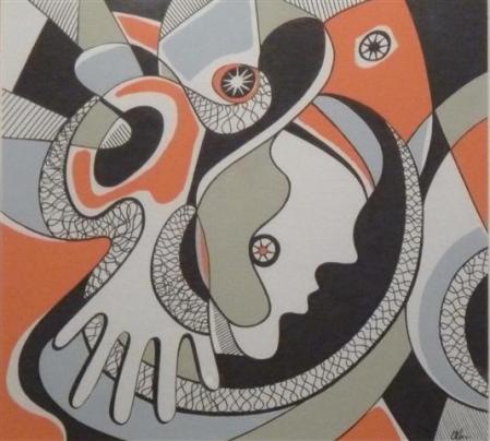
“My work is figurative,” he says. “Always figurative.”

I have to think this through, since I see so much abstraction in the works leaning against the walls, pinned to the wall, or stacked in the far end of the barn. The face or the figure is somewhat incidental in the overall. In my mind it’s just another shape, but with recognizable detail. I express my question and he answers, “Without the figure, there is little engagement.” He shows me the one and only non-figurative work in the studio and I easily see what he means. The figures are focal points that call out to be explored, considered.

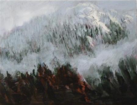
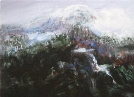
Mostly the figures are heads only, often a head tipped back on the neck, mysterious, evocative; but there is an image with a donkey and another with a one legged person, wings embracing the the figure from behind the head, which gives the impression that the other leg is there, but in shadow. Or is this one of the Queens, seated on a throne, with a single foot coming forward? For me, the ambiguity is a pleasure because then I need to ponder the work and engage with the figure. There are things to discover.

In explaining his imagery, Gislason theorizes, quotes philosophers and classic writers. He speaks of the difference between logic and myth. Logic is linear thinking, cold and calculating. Myth relates to feelings, poetry, magic. It’s the latter that he wants to have shine through in his work. Yet when I look at his silks, I see that there is an equal balance. The overall image may meet the emotional quotient he is seeking, but the formal qualities of the work – the placement of shapes and objects, the overall design are painstakingly considered.

His eyes light up as he talks. His energy bristles but is sure footed. He is a mystery. It’s these contrasts that he resolves that make his work interesting. Logic and myth. Simplicity and complication.

Work in progress containing map imagery

The new work incorporates images of maps, with small block shapes of them repeated to make large continents on the canvas. He continues with his luscious build-ups of texture, impasto painting which contrast with rich coloured flat areas. When you look from afar, it’s one image; when you are close up, there is so much intriguing detail. The edges are still pinned with clear-headed push-pins. They are part of the imagery, holding in place the soft silk edges which act as a signature framing element. The new works are in progress, not yet finished, up on the wall while he ponders the next step, the next modifications to the first layers of paint and the imagery. Orange and cadmium yellows predominate, but most often with a contrasting turquoise to set up a glowing vibration of colour.


Details – Fingerprinted edging with push pin; repeated block of map image bordered by impasto brushwork.

I left the studio feeling very privileged to have been welcomed into the inner sanctum. If you want to see more, check out his web site at jimgislason.com

Many thanks to Ted Lederer of the Elliott Louis Gallery who arranged the visit for me and accompanied me on the journey.

Check out the Elliott Louis Gallery at http://www.elliottlouis.com/

Read about the philosophy of Myth versus Logic in this document:

http://cheer.org.nz/mythoslogos.pdf